Step 1 – Canvas It’s important for this tutorial that you set up the same size canvas as the effects we’ll apply will vary depending on how many pixels it’s across. To use in smaller or bigger projects you will need to tweak the settings applied throughout this tutorial. Set up a 2500 X 1500 pixel, RGB document at 300dpi. Step 2 – Texting Select the Horizontal Type Tool, set the colour to a lightish grey and write your word. It’s best to use a fairly uncomplicated and bold font, I’ve gone for Avant Garde in Bold. Adjust the tracking to 50 as we’ll need space in between letters to allow for gooey growth. Press CTRL+T or go to Edit > Free Transform and resize your text by holding the SHIFT key (to maintain aspect ratio) and pulling one of the corner points with the mouse. Step 3 – Ready the Tools Select the Pen Tool and set it Shape Layers. Set the foreground colour to 40C, 10M, 100Y, 0K. Zoom into 100% and you are now ready to draw. Step 4 – Drawing Draw your first point at the start of the first letter. The best way to draw a curve is to position one anchor point at the origin of the curve and one at the end point or point at which the curve changes. To split an anchor point you hold the ALT key and click on the last drawn anchor point. This will delete the outward part of the handle and allow you to draw another one in (on the same anchor point) at any angle without altering the direction of the inward handle. This splitting technique allows for sharp angles following a curve. Step 5 – Editing your points Continue drawing loosely around the shape, adding some drips at the bottom to mimic gravity. Use the Direct Selection Tool (Behind the Path Selection Tool if you hold the mouse button) to manipulate the anchor points and the curve handles. In order to create an elongated bulbous end at the bottom of a drip you’ll need to pull the bottom facing handles out further. At any point if you’re not happy with the position or angle of your point, you can manipulate it with the Direct Selection Tool. Step 6 – Best foot forward I find it’s easier to draw the drips from top to bottom (following the gravitational pull) so once you hit the bottom of the letter, use the Direct Selection Tool to click anywhere on the canvas. Then select the first point (at the top of the letter) with the Pen Tool and draw in the rest. Something I forgot to mention earlier is to set the fill at 80% so you can see the letter underneath. Step 7 – Subtracting To get the hole in letters such as ‘O’ or ‘A’ you’ll need to set the Pen Tool to Subtract from shape area. Draw the outer shape of the ‘O’ and close off the path. Select the path thumbnail so that it highlights the path, set the Pen Tool to Subtract from shape area and draw in where the hole should be. Step 8 – Finishing off Complete the rest of the letters and set the Fill for each layer at 100%. Step 9 – Inner Shadow Select the ‘G’ layer and go to Layer > Layer Style > Inner shadow and setup as in the screen grab. Step 10 – Inner Glow Working on the same layer, select the Inner Glow setting and setup as in the screen grab. Step 11 – Bevel and Emboss Do the same with the Bevel and Emboss… Step 12 – Satin …And finally Satin. Step 13 – Copy and paste Select the ‘G’ layer and go to Layer > Layer Style > Copy Layer Style. Select the remaining letter layers and go to Layer > Layer Style > Paste Layer Style. Step 14 – Ol’ Drippy Draw in more drips on top of the letters. Copy and paste the Layer Style as before and go to Layer > Layer Style > Scale Effects… scale them back to fit the size of the drip, in this case it’s 40%. Then go to Layer > Layer Style > Inner Glow and scale the opacity back to 60%. Step 15 – Rasterize and Mask Create a new layer directly below the new drip you just drew. Select the drip and the blank layer and merge them (Layer > Merge Layers). Add a Layer Mask (Layer > Add Layer Mask > Reveal All) and use a soft-edged paintbrush loaded with black to mask off the top of the drip. Repeat this process until you’ve covered the word. Step 16 – Depth To add depth, draw some more drips beneath the letter layers. Copy, paste and scale the layer effects to save time. Step 17 – Texture It’s a good idea to add texture to the final text to make it feel more ‘real world’. You can either overlay an easily downloadable grunge texture or try the following method: Go to Filter > Noise and add a 2 pixel noise filter. Then go to Filter > Blur Gaussian Blur and apply a 0.6 pixel blur. My name is Gino Orlandi and I am a graphic designer and blogger. I have been freelancing since 2004 and in 2007 I launched You the Designer. I look forward to publishing quality graphic design resources, graphic design tips and much more on You the Designer with the hopes that aspiring design professionals, and pros alike, will find this site inspiring and helpful. Enjoy!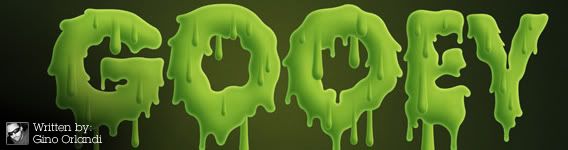
Create great looking, 3-Dimensional, gooey looking text . This technique does require minimal drawing skills but is definitely suitable for beginners. Enjoy and stay tuned for more tutorials!Gooey Photoshop Text Tutorial


About the author


0 Reply to "Great Gooey Photoshop Text Tutorial"
发表评论