Lola Rodrigues aka Loleia, is an awesome Illustrator from Spain and decided to share with us her ticks to a basic painting in photoshop, the tutorial is very simple and well explained so you can learn to paint your own drawings, check it out.
Make sure you check out the gallery of works of Loleia here loleia.deviantart.com and thank her for the tutorial.
So, the first think I need is a line art. This nice girl here volunteered, so we’re going to be coloring her.

The first thing I always do is name the layers, because I am kind of a neat freak and I need everything to have a name and be in its proper place. I call the line art layer –wait for it- Lineart.
Next, I create a layer underneath the Lineart and choose a background color to fil it with. I call the layer Background (tadaaa!)

Having a colored background is very useful when it comes choosing the color palette for the drawing itself because it makes you use a range of colors that are all similar, giving the final piece a consistent look color-wise.
I tend to choose pastels tones. Here I have picked yellowish ochre.
The next thing I do, neat as I am, is create a folder for the flat colors and call it Flats. Flat colors are colors without shadowing or light. They make the base of the coloring in my drawings. Inside the Flats folder I then create a layer for each different area of color’ the Hair, the Face, the Skin, the Shirt, the Shoes etc.

Now that I have layers, I can start coloring the drawing. I always start with the skin but you start wherever you want. To choose the skin color I just slid the arrows down from the yellow to the orange. The result is a skin tone that matches the background perfectly and is not too pale, nor too tan. You can play with this all you want; make it a bit pinker, or more orange if you want the skin to look more tan etc.
When I have chosen the color, I pick the Paint Bucket Tool, make sure the box “All Layers” is checked and I start filling in all the parts of the drawing that have skin in them.


I repeat this step with all the parts, but as you can see the Paint Bucket just fills the “easy parts”, it doesn’t go into the small places of behind the black lines of the drawing.

Make sure to add the colors in the appropriate layers this will be important later when we add the shadowing and need to select every individual color.

When we’re done filling in the colors, it’s time to fill in the little blank space with your tablet (or your mouse) and a round, hard brush. Zoom is love!

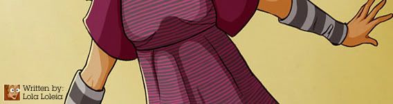
When I’m done with the flats I usually add any patterns or details I want the clothes to have. In this case the clothes are based on my own, so it will be easy to copy all the patterns using flat colors again.

The arm-warmers have big horizontal stripes and the shirt has pink vertical and horizontal stripes.
So I create a new layer inside the Flats folder on top of all the other ones and I call it Patterns. That’s where I’m going to draw all the details on the clothes. A lot of times I like to add textures to clothes as well, but I don’t add them until shadowing has been added.

It’s now time to start with the Shadows. The fist thing we have to do is decide where the source of light is. If it’s on the right, then the shadow will be on the left. If it’s behind, then the shadows will be on the front etc. I have decided that the light is going to be coming from the right, so the shadows will generally be on the left side.
The first thing I do now is create a new folder and call it Shadows. This time I will ad the shadow layer as I go (instead of adding them all at once, like we did with the flats). The reason for this is that I usually use more than one layer for each part of the drawing (for the skin or the hair I use at least three).
As I do with the Flats, I always like to start adding shadows on the Skin. So I create a new layer inside the Shadows folder and call it Skin. I set it to Multiply. Then, using Eyedropper Tool I sample the flat skin color choose a color slightly paler for the Shadow.

Here on 1 you can see the result of the first layer of shadow on the skin, set to Multiply. As you can see, most of the shadow is located on the right side of the face and torso, leaving the left side lit.

For this kind of shading I always use a regular default hard round brush. Applying more or less pressure on my tablet I can control the size of the brush, but the important thing here is that the brush’s edges have to sharp. Of course, depending on the brush you can use and the settings on that brush you’ll get incredibly different coloring and painting styles. But for this one, as I said, we’re going for the “sharp approach”.
A Little trick: go to the Flats and select the layer part you want to shadow (eg. Skin) using Ctrl (select the layer while pressing Ctrl). Then go back to the Shadows and you’ll be able to apply the shadow only to the selected part without fear of coloring “outside the lines”.
I add shadows to the rest of the skin on the girl’s body and then I create a new layer, also called Skin, and also set to Multiply. I then add a more detailed level of shadow, still using the same pale color as before. The result 2. You can see the first layer of shadow and then another one that goes around the eyes and on the outer edge of the right side of face and torso. Just add as much shadow as you feel like, and when you’re done, go on the next part, which for me is always the hair.

I basically repeat the same steps as with the face: I create a new layer called Hair and set it to Multiply. I then pick a color paler and lighter than the one I used for the Hair layers as I need and I add shadows as I see fit.

You can see a progression of the Shadow layers below. I repeat the same process on the rest of the parts of the drawing, each time creating a new layer and each time selecting a color lighter and pales than the one used for the Flat. In the case of the shirt, I chose to use the gray instead of the pink.


Now that I’m done with the Shadows, it’s time for the little details (blush etc) and some light. I create a new folder, this time on top of the Lineart layer, and I call it Lights etc.

I’m going to start with the blush, but first I’m going to get rid of the bit of light on her right cheek (you can see it above), or the blush won’t look good (try it, it looks weird).

When I’m all ready to go, I create a new layer inside the Lights etc folder called Blush, and I set it to Multiply.
I choose a red (in this case I used a pale shade of red as well), and then I pick a brush. The best brush for the job is the Airbrush Pen Opacity Flow. I set the Hardness to 0% and the size to 35 px more or less. (see below).

The Great thing about this brush is that its opacity responds to the pen pressure, which means that if I push hard with my pen, it will be opaque, but if I don’t, it will be translucent. So I picked the brush and I start applying the blush gently. I also like to give a little blush to the nose, jus to give more volume.

It’s time now to add a bit of light to the face. I usually add glow to the eyes, the lips, the cheeks and the nose.
For the eyes and the lips I use a small round hard brush (like the one I used to apply the shadows).
For the cheeks and the nose I however I use the same brush I used to apply the blush, only with more Hardness (50%) and much smaller (10 px or so).

A lot of times I also add a bit of shine to the hair, but this time just doesn’t look right so I will leave as it is. I will however add a bit of light on her left side, where the light source is hitting her.
For simply pick a small round hard brush and I paint a line inside the lineart along her right side as you can see here.

And it’s finally time for the finish touches! When I’m done adding the light, I create a last folder called Finishing Touches. In here I usually add a few Adjustment Layers, to tweak the color a bit, make it more vibrant, in this case I have added two Color Balance layers, one Selective Color and Curves layer to adjust the brightness a bit.

At this point I will usually add a Texture on top of everything and set to Multiply, just to make it a bit more gritty. The texture here is mine.
Before the Adjustment Layers

After the Adjustment Layers

+ Textures Set to Multiply

TADAA!

And that’s pretty much it! Of course I sometimes do more stuff, like add light and shadow to the background, or make a thick black outline or add a different texture to each layer of clothing, but the basics are these.

Hope it helped!


0 Reply to "Basic Coloring Tutorial by Loleia"
发表评论